Showing posts sorted by relevance for query design. Sort by date Show all posts

Tuesday, April 18, 2017

Design Matters

Over the years I have, at times, highlighted noteworthy design changes in cereal boxes. In a crowded grocery story aisle, it is critical that a brand have a clear identity that stands out from the competition. Unfortunately, many cereals suffer from either bad design or being stuck in decades old time warp. This is puzzling, especially considering the struggles that the cereal industry is having. You would think there would be more experimentation and innovation with this aspect.

Every once in a while, however, a cereal company breaks the mold and does something fresh with design. For example, recently, we have seen this with the new look at Kashi. And, now another great example rises to the forefront from the United Kingdom. There, the Good Grain brand has gone through a recent transformation, and it looks great!


As you can see in the before and after photos of one of their cereals, they have a adopted a simplistic look that is bright, fun and captivating. Previously, as is typical with most cereals, the box was cluttered with a lot of text, and the obligatory decked-out bowl of cereal. The new design has been radically cleaned-up, and seems to leap off the shelf into the shopping cart.

I hope more cereal companies are paying attention to these design changes. Again, this is an area they seem to have ignored in their quest to turn around sagging cereal sales. It is not the full solution, but it would go a long way to improve the image of these breakfast staples.

(Source: Brand New)

Friday, March 21, 2008

Design matters

One of my favorite marketing blogs is Brand New, which focuses on corporate and brand identities. They recently commented on Kellogg's re-design of the logo and package design of Smart Start cereals. Overall they are not impressed with the changes.

Whether you like the changes or not, the real issue here is that there is much more to cereal box design than meets the eye. Your first glance at a box when walking down the cereal aisle provides a critical moment in your purchasing considerations. Ideally the packaging will project an image that resonates with your needs and desires, and is consistent with its contents. All successful consumer goods do this.

This is one of the reasons that cereal boxes themselves are fascinating, and a critical part of the overall breakfast cereal culture.

Technorati Tags: , , , , ,

Thursday, January 29, 2015

Wheaties: Going forward by going back

January is typically a busy month for me, so I've been rather quiet here on and on social media, but with all that's happening in the cereal world, it's time to get back!

Over the years Wheaties has been one of the favorite topics on this blog. The venerable brand has been a showcase of cereal marketing and how it expresses itself in American culture, but for at least a decade has struggled to find itself. There have been numerous attempts to revive the cereal, including the ill-fated Wheaties Fuel, but nothing has seemed to work.

It was not that long ago when Wheaties was known for its representation of high profile professional sports teams and athletes. I'm sure, however, General Mills discovered that after all the licensing fees and costs associated with that, sales just did not warrant continuation of that strategy. Last year, however, we began to see a definite shift more toward high profile athletes outside of the major professional sports leagues, that is, athletes from extreme sports that attracted a much younger audience. Even the box design was updated to reflect greater energy and with a more contemporary feel. And, last summer the company engaged consumers in a way to vote for the next star to grace the cover of Wheaties, from a roster of athletes representing motocross, para-athletics, lacrosse, mixed martial arts, and women's soccer. The winner of the contest was Anthony Pettis, the Ultimate Fighting Championship (UFC) lightweight champion in 2013, a definite sign that Wheaties is being taken to a whole new generation.

Apart from the new breed of athletes that are starting to appear on the boxes, of equal interest is the new, or rather old, Wheaties design that has appeared with this rebirth of the cereal. Gone is the noisy, colorful redesign attempt of the last year or so. Instead, Wheaties is returning to its roots, with a simple orange and white box, with no extraneous markings to distract from what really matters, the athlete. While millenials do not have memories of the boxes of 30 or 40 years ago, the stark throwback nature of this design is bold and should stand out on the grocery store shelves.

It will be interesting to watch whether this latest strategy is the one that General Mills needs for success with Wheaties.

Now, if they could only update the cereal itself, but that's another story...


Sunday, November 26, 2006

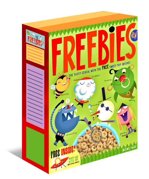
Freebies: Reinventing the cereal box?


One of the most fascinating aspects of cereal is its marketing through the use of creative packaging and promotions. Looking back to the 50's and 60's one sees this trend developing, with many fun cereals, boxes, and free premiums inside. Certainly, the marketing of cereal is as prominent as ever, but the simple fun of the past has been largely overtaken by more slick efforts.

That may be about to change with Freebies, a proposed cereal by Bob Staake, a nationally-known illustrator who has experience in this field, having once done design work for Ralston Purina cereals. Staake has created a six zany characters and a fun cereal box design, with the proposal of also including free toys in the box. According to his website:

"FREEBIES is a cereal that recognizes that today's kids and parents are smart -- and will respond to a healty product that entertains and teaches something of value in a small, yet goofy and entertaining, way. ... "What I wanted to do with FREEBIES", said Staake, "was create a positive character-driven storyline that could break through the clutter of marketing-oriented product in the supermarket cereal aisle. Kids don't want to be sold DVDs and ocean cruises that are routinely advertised on the back of today's cereal boxes.
They want to sit there and become engaged in a fun and playful world while they eat a breakfast cereal that their parents can feel good about. To me, FREEBIES is about returning some innocence into the first meal of the day for a child-- and maybe giving them a giggle before they go off to school."


Staake's hope is that his design and accompanying website will catch the attention of major cereal manufacturers who are looking for a way to be more responsive to what consumers are actually looking for.

If he is successful at selling his idea it might see the start of a new era in cereal boxes.


Technorati Tags: , ,

Monday, January 09, 2012

New looks at Quaker

Recently I highlighted some new developments from Kellogg and General Mills plus ownership changes coming at Post. Now, Quaker is making the news to begin 2012. Although I haven't seen any news releases or any changes showing up on their website yet, evidence is starting to appear in grocery stores. It appears that most of Quaker's leading cereal brands are going through some significant packaging design changes. Life is getting a fresh new look that is simple but stands out among the competition with its contemporary design. Also, notice that Quaker logo itself on the package is highly refined, giving a look that reinforces the company's heritage. I've also seen some images of some other re-designs, includes Quaker Oatmeal Squares. Packaging is one way for companies to carve out their identity and market position, and this is one of the most impressive design updates I've seen in the cereal industry.


Also, I spotted a new cereal, Whole Hearts. Essentially this is Quaker's version of Cheerios (although it claims to be "lightly sweetened"), but instead of just copying it like all the generic brands have, it comes in heart-shaped pieces with a much clearer message of the heart benefits of oats. Good move from an oats-driven company.

Monday, February 19, 2018

The art of box redesigns

I have long argued that the box has been the most important aspect when it comes to breakfast cereal. No other food has been sold more on the basis of its packaging than with cereal, and the designs and characters found on cereal boxes have had a profound effect on our psyches and the larger culture.

Over the years we have seen every cereal brand update its boxes with fresh designs and artwork; however, most of the time the changes are incremental, providing more of an evolution than a true transformation. It is recognized that boxes have to keep up with the times (and competition), keeping consumers engaged.

So, while change is a constant, two recent prominent cereal box redesigns have caught my attention. Very recently, actually in the last few days, I came across a fresh new look for Kellogg's Froot Loops. Up to this point, most of the heavily sugared, "fun" cereals have been cartoonish, touting largely flat designs and solid colors. This latest edition is bold and energizing, placing emphasis on the mascot (i.e. Toucan Sam) and not on the cereal name, and giving him a much more realistic 3-D look. Even the bowl of cereal is different than what is typical, showing a side view of a glass bowl, jumping with excitement. I'm assuming we'll see many other Kellogg cereals adopt this style, and that should really make them pop on the shelves. Good job, Kellogg!

Another redesign has also recently been noted. This time it is not one of the big brands, but a smaller company that focuses on organic, health food cereals. Canadian-based Nature's Path is the leading independent brand in this segment, and has carved out a significant presence in most grocery stores across North America. Obviously, they are going for a different look than Froot Loops, focusing on natural ingredients and messaging that reinforces their health orientation. With the changes they have announced, they are moving away from a more serious look to one that is somewhat less stuffy. This is accomplished with new layouts, stronger colors and more irreverent typeface. While in an interview with Packaging Design they gush over the changes, I'm not convinced the new boxes are all that they could be. In many ways, the new design is too busy, distracting from the serious cereals that Nature's Path is selling. The company also has a sub-brand, Envirokidz, targeted to children. These boxes are getting a new look as well, and these seem a much better fit.

Again, these are just two examples of many box redesigns we have seen over the years. But, they illustrate the challenge that companies have in doing this. It is certainly not as easy as it seems, and the ultimate tests will be consumer reaction and sales. Having said that, however, very few of these design changes really make a big difference, as most companies are much too timid to try something truly "out of the box." There are some exceptions, however. Two of the best cereal box transformations that I have seen in recent years come from Kellogg-owned Kashi and Britain's Good Grain. Kashi went super simple focusing on a super-enlarged cereal piece on each white-spaced box, giving a distinct appearance. Good Grain demonstrated how to move away from a conventional cereal box also with greater simplicity, and pronounced color schemes.

Changing cereal boxes is not by itself going to turn the tide of declining sales, but if cereal companies want to revitalize this industry, one important strategy is to focus more on the box, and the messages these important vehicles send to consumers looking for something interesting.

Thursday, August 31, 2006

Simple Cereal Box design

I have frequently highlighted the importance of cereal boxes in the marketing of cereal. Typically, cereal companies have focused on innovative designs featuring cartoon characters, sports figures, and other popular culture icons. An article that orginally appeared in the Washington Post (but reprinted in the Fort Wayne Journal Gazette) examines a new trend in cereal box design: simplicity. A clean, attractive way to cut through all the clutter in the grocery store cereal aisle.

Technorati Tags : , , ,

Monday, March 13, 2006

Cereal design

I've focused a lot on the marketing of cereal through boxes and advertising. But, have you ever thought about the design of the cereal itself. You know: flakes, squares, circles, etc.
 
2wice has a Periodic Breakfast Table, a chart outlining some of the major designs in the cereal itself. The photo isn't very clear, but nevertheless interesting.
 
It's more than science, it's also an art!
 

Technorati Tags : , ,

Tuesday, September 29, 2015

Creative Packaging

Over the years I have highlighted innovations in cereal packaging. If companies are looking to innovate this is definitely one area in which there still is lots of room for creativity and new thinking. Unfortunately, it seems to be difficult for the major players to think "outside the box."

Recently I came across some concept projects developed by a graphic design student, Mun Joo Jane, at the Art Center College of Design in Los Angeles. She came up with a couple of cereal packaging ideas that truly draw attention. In particular, her Special K package (rebranded as K+), while elaborate, would certainly stand out on the grocery store shelves and at home.

Take a look at this idea, plus a much more austere concept, and tell us what you think: https://www.behance.net/gallery/27278793/Kelloggs-Cereal

I wonder if the cereal companies are paying attention?

Thursday, March 01, 2007

Innovative Design


To get attention in a crowded cereal market you have to stand out. Dorset Cereals in the U.K. appears to have done so with their very attractive line of cereals. Obviously these are targeted to adults, and they represent a health-oriented brand. Nevertheless, rarely does one see true packaging design innovations in cereal, which is strange since few other commodities are so dependent on their packaging. Dorset is an exception.


Technorati Tags: , , ,

Tuesday, July 26, 2016

New Look at Kashi

Kellogg owned cereal-maker Kashi recently unveiled a fresh new look intended to reflect "its belief that food should not only taste good, but do good." The new design includes its revised logo, and packaging that is contemporary and simple in appearance. The boxes certainly stand out for their clean look, avoiding most of the visual clichés common on cereal boxes such as a bowl of cereal, and excessive design elements. Instead the focus is on ingredients and cereal itself at the most basic level. The back of the boxes feature stories of "how the food was made and where it comes from – including employees, farmers and friends of Kashi who had a deep impact on it."

For quite sometime Kashi has struggled to find itself as a natural and health-conscious brand in the Kellogg portfolio, while becoming more and more mainstream in its distribution. Packaging has always been a big part of cereal's success and place within our culture, and this new look, while basically simple, should give the brand new life, if applied consistently across its product line. In my opinion, it's also a far superior effort than the cartoonish appearance of the new Annie's cereals recently launched by General Mills.

What do you think of the new look?

Thursday, December 15, 2011

Cereal by Design

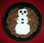
Breakfast can be fun, and a father and mother team, Harry and Joann Margulies, are intent on ensuring that with their website/blog, Cereal by Design. They are not the first to use cereal in art, but they have added a new twist: highlighting examples of how ordinary people can liven up their breakfast bowls with cereal art. Check it out: http://cerealbydesign.blogspot.com/

Tuesday, November 23, 2010

Obol

Over the years I have highlighted the inventions of passionate cereal lovers, such as innovative bowls.

The latest is the Obol, which bills itself as "The Original Crispy Bowl", designed to eliminate soggy cereal (although some people like milk-drenched cereal!) With a unique "Swoop n Scoop" design, the cereal and milk are kept separate until that moment that you move your spoonful of cereal in and through the milk.

What is particularly noteworthy of this bowl is its creative design, which includes its ability to be easily held.

Could this be a new way to eat cereal?

Technorati Tags: , , ,

Wednesday, June 27, 2007

Cheerios in shape

General Mills Canada has introduced an innovative, curved box for Multi-Grain Cheerios. This creative design sends a strong marketing message about managing weight using the cereal. In a cereal marketplace crowded with this message General Mills has found a unique way to stand out.

Technorati Tags: , , ,

Sunday, October 30, 2011

Halloween cereal

Halloween and cereal are a perfect fit, and a number of companies have taken advantage of the marketing opportunities over the years, and none more than General Mills. Again, this year, they released their monster cereals in time for Halloween, but they were largely unchanged in box design from 2010. Several other children's-oriented cereals feature similar seasonal graphics again this year.
But, in my opinion, the award for the best Halloween cereal for 2011 goes to Quaker for the introduction of Halloween [Cap'n] Crunch. This is a unique, limited-edition cereal that should provide the most breakfast fun this year.

And the milk turns green!

Thursday, May 24, 2007

Imported cereal

For the most part breakfast cereal in North America is manufactured and distributed here. But, like everything else, globalization is changing things. Could cereal be next? This would definitely put pressure on the big cereal companies, forcing price wars, etc.


I was in my local grocery store today and saw cereal imported from Argentina, but packaged for the U.S. market. "Global Brands" produces several knock-off varieties of popular favorites like Corn Flakes and Froot Loops. The packaging was less than impressive with thin cardboard, off-color photos, and amateurish graphic design.


Why would people buy these? Price. 98 cents a box. It obviously targets the low-end sector of the market, but still it is one more pressure that the cereal companies don't need. Or, maybe it will force them to compete even more with innovation.


We'll keep watching.


Technorati Tags: , ,


Friday, April 18, 2008

Cheerios beyond the bowl

Have you noticed how almost all cereal boxes on the front feature a picture of bowl with its cereal? Sure, the box contains what's depicted, but is it always necessary?

General Mills has introduced a new design for its flagship Cheerios line, and there's no bowl! Instead are an attractive assortment of O's, strongly reinforcing an already strong brand. It's a sharp look that will make Cheerios stand out on the grocer's shelf.

It's time for some other cereals to sport a new look!

Technorati Tags: , ,

Wednesday, October 11, 2006

Monster Cereal time

Every fall, leading up to Halloween, General Mills re-issues its three famous "monster cereals": Count Chocula, Boo Berry, and Franken Berry. (See last year's HERE)

For 2006 General Mills has developed a creative, non-traditional cereal box design (as they did in 2004) to highlight these three cereals. Look for them on cereal shelves around the U.S.


Trivia. Years ago, there was a fourth monster cereal: Yummy Mummy. Wouldn't it be great if they made a special release of it next year?


Technorati Tags: , , , , , , ,

Monday, March 10, 2014

Sink Bowl

Over the years it's been fun to report on new concepts for cereal bowls. Inventors try to overcome some of the challenges we face when eating cereal, mostly the issue of sogginess. The latest is the "Sink Bowl" a design concept by Sherwood Forlee.

The Sink Bowl is actually two bowls, one stacked on top of the other. The top bowl has a small plug in the bottom. When your cereal has been in milk for just the right amount of time you simply pull the plug to let the milk drain out to the lower bowl.

Perfect? The Sink Bowl does not appear to be available for sale so I haven't actually tried it, but for those are picky about soggy cereal this could be a solution. My concern is with the small little plug and the attached cord. There's got to be a better way to handle that, but then of course it wouldn't be a sink!

Tuesday, August 07, 2007

Cereal and bloggers

It's been a long time since I last listed significant blog postings pertaining to cereal. Here are some over the past couple of months that caught my attention:

Samuel L. Bronkowitz presents comments on the not-so new-shaped Trix.

Girls Cash Cars reveals a simple, but hilarious Shreddies advertisement from Canada.

The Ramblings of a Collegiate Designer is about a graphic design student's adventure in creating a cereal box.

The Toque rallies against granola

Kellogg's new Cereal Straws have been getting considerable attention on the blogosphere, including: The Impulsive Buy, and The Thoughtful Bagger,

Technorati Tags: , ,